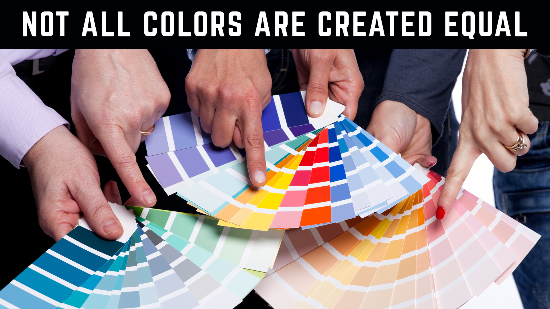
Introduction:
In today’s digital age, vibrant colors are everywhere. But have you ever noticed how your brand’s logo or website colors might look different in print? This isn’t a trick of the light – it’s the difference between how colors work on screens (RGB) versus printed materials (CMYK). This can be a significant challenge for local businesses striving for a consistent brand identity. It’s all about CMYK versus RGB color spectrum
The Digital Illusion & The Reality of Print
Digital design tools offer a dazzling array of colors. Unfortunately, not all these colors translate seamlessly to print. The RGB model used by screens can’t always be accurately reproduced in CMYK, the standard for printed materials. This means your eye-catching digital designs might appear muted or altered when printed on brochures, banners, or business cards.
RGB vs. CMYK: Why It Matters for Your Local Brand
- RGB (Red, Green, Blue): The building blocks of color on screens, combining to create millions of shades.
- CMYK (Cyan, Magenta, Yellow, Key/Black): The ink colors used in printing, with a more limited range than RGB.
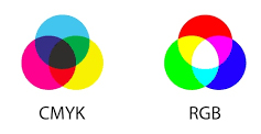
The difference between RGB and CMYK can lead to unexpected color shifts when moving from digital to print. This can impact your brand’s professionalism and recognizability in your local community.
Common Color Challenges & How to Overcome Them
- Monitor Variations: Different screens display colors differently. Even a calibrated monitor might not perfectly match how a design will print.
- Lighting: The type of lighting in your workspace (natural, fluorescent, etc.) can alter your color perception.
- Projected vs. Reflected Light: Screens emit light, while printed materials reflect it. This fundamental difference can cause color discrepancies.
Partnering with Print & Design Experts for Brand Success
Collaborating with experienced printing professionals is key. They can help you:
- Identify potential color issues early in the design process.
- Recommend alternative colors that translate well to both digital and print.
- Ensure your brand colors remain vibrant and consistent across all your marketing materials, from your website to your storefront signage.
Your Brand’s Colors: More Than Just a Pretty Picture
Selecting brand colors is both an art and a science. It’s about creating an emotional connection with your local audience and making a lasting impression. Let’s discuss how we can help you navigate the complexities of color selection and ensure your brand shines both online and offline.
PrintFast is Your Local Partner for Print & Design Excellence
Ready to elevate your brand with colors that truly represent you? Contact us today for a free consultation. 800-810-4818.
Keywords & Phrases:
- Business branding
- Color selection for print
- RGB vs. CMYK
- Brand consistency
- Print marketing
- Digital design
- Color matching


